Monitor Calibration and Profiling
Monitor Calibration Methods
If you can not trust the colors displayed on your monitor, all other color management is a waste of time. Calibrating and profiling your monitor should, therefore, be your first priority. Luckily, it is the easiest part of the image capture, editing, and printing system to profile. The cost to do this ranges from free to expensive. If color accuracy and the ability to match your prints to your monitor are important to you, a decent hardware calibration system is essential. With a little work you can get good color from your monitor. If digital photography is your business, or you simply want the best colors you can get, the expense of a high quality calibration system is more than justified.
The most basic calibration tool, other than ignoring calibration altogether, is Adobe Gamma. This is certainly better than nothing, but leaves much to be desired. The sole advantage is that it is free (once you purchase Photoshop). The primary problem is that your basic eyeball calibration is highly influenced by ambient lighting, how much sleep you've had, and how much coffee is coursing through your veins. Obtaining a consistent viewing environment is difficult under these conditions. If you are stuck with eyeball calibration, Norman Koren put together a set of charts that work better than those bundled with Adobe Gamma — scroll towards the bottom of this page.
Hardware-based monitor calibrators provide far more accurate and repeatable results. The results of our ongoing tests and reviews of monitor calibrators is found here.
To get the best results from your monitor, it is important to understand the steps involved. The first is calibration; i.e. setting your monitor to a well-defined, standard state. You need to select a color temperature to work with. PC video cards and monitors are usually shipped with a white point set to 9300°K. This gives a bluish tint to everything. It is often used for CAD work stations or in video games where maximum color contrast is desired. For photography, however, color accuracy is more important. The next standard color temperature is 5000°K (or its close cousin D50). This is the color of lighting in art galleries, and approximates sunlight. On many PC monitors it produces white colors with a dingy, yellowish cast. For some Macs, it is a viable choice. A better choice is often 6500°K (or D65). Most monitors reach useful brightness levels much more easily at 6500°K/D65 than at 5000°K/D50. Also, some monitors display reddish highlights at D50. Play with your monitor settings and decide which looks best.
If you have an LCD screen and your calibration system allows using the native white point, do so. This preserves the maximum possible color range on LCD monitors.
Next, select the gamma to use. The traditional value for older black and white Macintosh monitors was a gamma of 1.8. This also worked for video systems capable of only showing 16 colors. Almost all modern CRT monitors, however, have a native gamma of close to 2.2, which is determined by the design of the electron guns. The farther you drag the video system from this optimal level, the more calibration artifacts such as shadow banding and posterization appear. Therefore, a gamma of 2.2 allows for the maximum range of colors your system can display. Ideally, a monitor calibration system allows calibrating to the native gamma.
After selecting a color temperature and gamma, the next calibration step involves setting the black (brightness) and white (contrast) levels to their optimum values. Start by setting the black to zero and the contrast to 100%. On CRT monitors, contrast at 100% usually gives the most possible colors, but is sometimes uncomfortably bright. LCD monitors usually need the contrast reduced slightly to avoid blowing out all fine details. Your calibration software will guide you to getting the optimum level. The brightness should be set so almost black is just barely distinguishable from pure black. Set brightness too low, and all your shadow details go dark. Set too high, the shadows get washed out. Again, follow the instructions in your calibration software. Most calibration software and/or hardware works best, however, if you start the adjustment process with the brightness and contrast controls set to their extremes.
Once you have the screen levels set, the Red, Green, and Blue guns need to be balanced so neutral colors do not show a color cast. Do as many of these adjustments by using your monitor's display controls as possible (don't worry, your calibration software will give details on how to do this). Adobe Gamma or any of the hardware calibration packages can do everything by adjusting your video card alone, but the result is a reduced color gamut for your display. This is not good, as you will clip the purest, most saturated colors.
After the monitor is calibrated, a profile is made. If you used Adobe Gamma, the program merely writes out a profile table describing the adjustments you made. If you used a hardware calibrator, the sensor measures a set of color patches to determine the limits of the monitor's color display capability. You can see which monitor profile Photoshop (version 6 and above) is actually using by opening Edit->Color Settings. Expand the RGB working space list, and scroll up. You'll see a line with "Monitor RGB - xyz." The file listed instead of xyz is the monitor profile Photoshop displays all images in. This is important to check, as some profiling software packages can write invalid profiles. If this occurs, Photoshop ignores the profile and displays in a default space that is guaranteed not to match your monitor.
We have a pair of test images to help evaluate your monitor calibration. The first is a test of the black point and shadow performance. The second diagnoses incorrect gamma settings and provides an overall check of screen neutrality.
Notes:
- Before you embark on any monitor calibration journey, make sure your display is suitably warmed up. This entails having the display on (and not in screen saver mode) for an hour or so. Also, try to minimize any glare on the screen, or light shining directly at the display. This is particularly important if you are performing calibration by eye.
- The characteristics of a monitor change with time. It is a good idea to re-calibrate and profile your display every week or two.
Evaluation Charts:
 As a rough check of your monitor calibration, you
can compare an
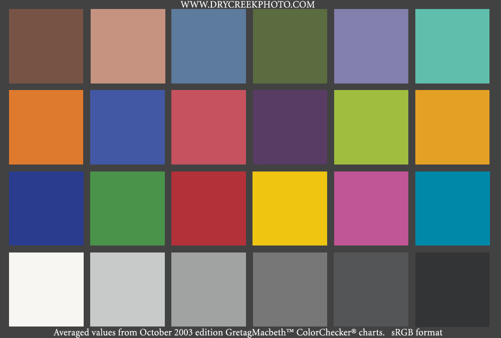
electronic version (converted to sRGB) of a GretagMacbeth™ ColorChecker® to
the real thing. For a more accurate comparison, we have different editions of the chart in several formats. These charts are based on measurements averaged from multiple charts. GretagMacbeth changed the paint formulation for recent ColorChecker editions. The colors are reasonably consistent within each formulation version, with larger differences between recent and legacy paints.
As a rough check of your monitor calibration, you
can compare an
electronic version (converted to sRGB) of a GretagMacbeth™ ColorChecker® to
the real thing. For a more accurate comparison, we have different editions of the chart in several formats. These charts are based on measurements averaged from multiple charts. GretagMacbeth changed the paint formulation for recent ColorChecker editions. The colors are reasonably consistent within each formulation version, with larger differences between recent and legacy paints.
-
Recent paints (October 2003 Edition):
- CIE LAB format (compressed tiff).
- CIE LAB format with value labels (useful for Adobe Camera Raw calibrations - compressed tiff).
- ProPhoto RGB (useful for calibrating Adobe Camera Raw - compressed tif).
- Adobe RGB 1998 (print reference or ACR calibration - compressed tif).
- All the above charts in uncompressed tiff format: Windows/Zip or Mac/Stuffit archives.
- Usage notes, terms, and conditions for the October 2003 images.
The charts below are for the older paints, used from 1976 until the recent reformulation to more environmentally friendly paints.
-
Legacy paints (July 2000 Edition):
The Color Checker chart is available in two versions. The first is the full sized 8x11" target most useful for general work. The second is the Mini ColorChecker in business card size of 2.5x3.5 inches. This is useful as a portable reference.
© 2020, Dry Creek Photo. All Rights Reserved.