Preliminary evaluation of Epson R2400 ICC printer profiles
We recently received Epson R2400 print samples not covered by NDA'a that we could publish results on. Among the first were ones were kindly provided by Uwe Steinmueller of Digital Outback Photo. We made an investigation into the behavior of both Epson's default profiles and ones we could make. Several conclusions could be drawn quickly:
- Epson's canned profiles appear to be of fairly high quality. The profiles are biased towards smooth color and tonal response rather than absolute accuracy. This is a safe course for generic profiles - one does not want to introduce quirks specific to one particular printer into a generic profile.
- Epson shrank the file size of their profiles by only using a seventh as many profile points for the simulation tables as they did for the output tables. Profiles have two independent sets of color tables. One is used for output; e.g. converting your image from a standard color space to the printer's color space. The second set of tables are most often used for simulation. These come into play when soft proofing how a final print will appear. Having less resolution in the proofing tables matters to photographers who fine-tune each image to wrest the utmost from their printers, but is of little importance to people who simply set the printer to use ColorSync or ICM and never think about profiles again.
- Like most printer profiles, the Saturation rendering intent in Epson's profiles is best left unused. It follows the traditional approach of maximizing color saturation whether it is needed or not. If you are printing your latest business pie charts on your 2400, use Epson's Saturation rendering. Otherwise avoid it.
The previous generation of Epson's printers, the R800 and R1800, had problems with certain shades of green and brown. Prints had little contrast in these colors, resulting in flat, smudged areas that should have contained detail. The root cause of this behavior is the poor ink linearization and ink limiting provided by the Epson driver. A carefully constructed printer profile can largely compensate for this behavior. We were interested to see if this behavior carried over to Epson's latest printers. Ink limiting and linearization has been a weakness of Epson's printer drivers for years, present from the time of the venerable 1200 in 1998.
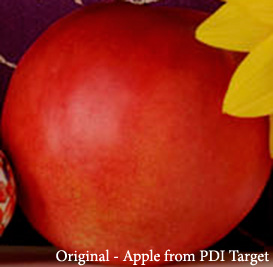
The good news is that the R2400 is better in this respect - not perfect, but better. The main areas where we saw problems were in vivid reds. The image below illustrates the effect on Epson Premium Semigloss paper. It is a crop from the widely distributed PhotoDisc target. The full target, along with other test images, is available in the tools section of our site. By hovering your mouse over the text below the image, you can see the difference the Epson profile makes. Certain shades of saturated reds are flattened out slightly and shadow transitions become more abrupt. Note also the posterization of the purple velvet background in the upper left.
The profile we built for the R2400 largely eliminates this effect. There is a slight posterization of the purple velvet - this being a particularly problematic transition area for the Epson driver - but the apple's color shading remains close to the original.
|
| Show Epson Generic Semigloss Profile |
Show Dry Creek Photo Profile |
Place mouse over text in boxes above to switch images (wait for new image to load) |
Details:
- The difference in rendering quality between the profiles is not huge. As noted above, Epson's generic profiles are of much better quality than previous offerings.
- A reasonably good quality monitor is required to see the changes when the Epson profile is swapped in. If you see no difference between the original and the version converted to the Epson profile, check your monitor calibration.
- Your browser must have Javascript enabled to swap images. Depending on your connection speed, you may need to wait a bit for the updated image to download (you'll see the image caption change when it does).
- Images were converted from Adobe RGB source to each printer profile using Adobe Photoshop CS2, Relative Colorimetric rendering, Black Point Compensation enabled. All images then converted to sRGB for web viewing.